POPULAR COURSES
Master Programs


Table of contents
|
1. What is Data Visualization |
|
2. The Role of Data Analytics in Data Visualization |
|
3. Main Types of Data Visualization Methods |
|
4. Top Data Visualization Tools |
|
5. Why Should You Learn Data Visualization in a Data Analytics Course? |
|
6. Insertion of Data Visualization into Real-Life Principalities |
|
7. Solving Problems of Data Visualization |
|
8. Data Visualization: Its Future |
|
9. Conclusion |
What is data visualization, and why did it become so crucial in today's world of analytics? In the era of information overload, inferring patterns from large collections of data can prove to be challenging. Scraping off the mess comes down to data visualization, which is present in cool little words of representational information. You are a learner, a data fanatic, or a full-time worker; the art of data visualization can give you an edge. This article will tell you not only what data visualization is but also why it occupies such a prominent spot in any data analytics course in Pune or any other place.
What is Data Visualization
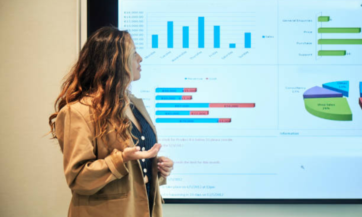
Data visualization, in the easiest terms, is a graphic representation of data and information. Data visualization presents the information on charts and graphs and maps, and dashboards to interpret data instead of viewing raw numbers or tables. In this way, it becomes simpler to detect trends, patterns, and outliers within large sets of data. Just think that you receive a spreadsheet containing thousands of entries; it is hard to determine the meaning of these numbers. However, when the same information is given in the form of a bar graph or a line graph, it is a lot easier to read about the distribution of the information and how it relates.
The Role of Data Analytics in Data Visualization
Data visualization is one of the modules that constitute a part of the curriculum of any course in data analytics . It is so since data analytics is not just about number crunching. It is all about obtaining actionable insights and communicating these insights to others. Methods of data visualization, such as histograms, pie charts, scatter plots, and heat maps, aid in converting complicated analysis into a simple, picturesque format.
These visuals not only contribute to the improved analysis of information by professionals but also aid the process of relaying the findings to non-traceable audiences as well. An effective picture is worth a thousand words, and it can convey the message more effectively and faster in comparison to a report.
Main Types of Data Visualization Methods
Most data visualization options today are specific to the type of data visualized or the purpose of using it:
-
Bar charts and column charts: Bar charts and column charts; they are best used when you want to compare the quantities in categories.
-
Line charts: The charts are useful when it is required to reveal a trend using time.
-
Pie charts: useful to show the part to the whole, but with few categories.
-
Scatter plots: The Scatter plot can be used when studying relationships and correlations between two variables.
-
Heat maps: These are the maps that are superb in terms of portraying the density of information and diversity.
-
Geographical maps: This should be used mostly when the information is linked to areas or places.
The main thing that students learn in a data analytics course in Pune is when to employ and use each way of presenting data visually.
Top Data Visualization Tools
Today, due to the infiltration of technology, data visualization tools come in many diverse varieties able to accommodate any user type, from beginners, experts and analysts. Microsoft Excel has always been a favorite among beginners because it is simple, with easy chart creation options. Tableau is one more potent product that is characterized by a drag-and-drop interface and an interactive dashboard. Power BI is one of the most widely used tools created by Microsoft and is actively expanding in popularity, particularly in business environments.
Advanced users and people who do not mind writing code are more flexible and can customize any visualization using Python (Matplotlib and Seaborn) or the R package (ggplot2). Google Data Studio and QlikView can also be considered as reliable options for professionals who want to have more capabilities.
The choice of the best data visualization tools will rely on factors such as the complexity of your data, the audience to be targeted, and your technical knowledge.
Why Should You Learn Data Visualization in a Data Analytics Course?
One thing that is often highlighted as part of a data analytics course in Pune is a heavy emphasis on data visualization. The reason is that all the phases of data analytics, including cleaning data to modeling it statistically, can be gained by visualization.
To begin with, data exploration becomes simplified through visualizations. You may easily detect any problem with the quality of data, notice gaps, or find some trend that may be of interest to dive into. Second, the data analytics should transfer the results to stakeholders after finishing the analysis. This is where visual storytelling is best. Data visualization guarantees that intricate discoveries are explained in a manner to enables decision-makers to make deliberate moves.
Also, students would be versatile after learning data visualization tools. They can both deal with projects on their own and work more effectively in a team since they can not only analyze the information but also explain the findings.
Insertion of Data Visualization into Real-Life Principalities
Different enterprises in various sectors are also focusing on data-driven decisions today. Whether it is sales forecasting or customer segmentation, or social media analytics, data visualization is an important aspect. An example is that a retail manager can employ heat maps to know the high-producing locations of stores. An online marketer may also plot line charts to monitor the number of visits that his/her web page is getting.
Learning how to use various data visualization techniques will also turn students into data storytellers rather than data consumers. That is why every holistic data analytics course in Pune can spend such a considerable amount of time and resources on real practice activities with data visualization tools.
Solving Problems of Data Visualization
Although data visualization is interesting, it also has problems. Badly-made illustrations may deceive or puzzle the viewers. A decent chart has a chance of becoming a pain because of the wrong type of chart used, cluttered graphics, or the lack of attention to color accessibility. During a quality data analytics course in Pune, one not only acquires the skills of preparing visuals but also adheres to good principles of design and honesty.
Besides, data privacy and moral visualization have significance. The visuals must be succinct and honest, as they portray the information accurately and in their proper proportion.
Data Visualization: Its Future
The demand for data visualization will simply rise further with the increase in data volume and complexity. There is no existing interactive dashboard, real-time, and AI-driven automatic insights that are making data visualization more dynamic than ever. The ability to be flexible in data visualization tools has become a professional skill that can grant several avenues in the field of analytics, business intelligence, and data science.
Conclusion
In short, learning the meaning of data visualization and becoming a competent user of numerous data visualization techniques is important to contemporary data professionals. You may want to take a data analytics course in Pune or improve your job qualifications, which will help you gain confidence and boost workplace achievements due to the ability to work with outstanding data visualization tools.
Data visualization should not be limited to the creation of pretty pictures but rather the process of making data mean something to every person and making it accessible and easy to comprehend. Whenever you have your initial experience in the world of analytics or want to enhance your professional development, keep in mind the following phrase: all good data stories begin with a good visualization.
Apponix offers the best Data Analytics course in Pune, presenting an all-inclusive curriculum that prepares students to take on the challenges of the job market with essential data analysis and visualization skills, ready to change and shape their futures forever. Do it now!

Apponix Academy
Apponix Academy