POPULAR COURSES
Master Programs





Table of contents:
|
1. The Core Foundations: Understanding the "Why" Behind the Screen
|
|
2. Designing for Humans First: Empathy in Action
|
|
3. Modern Patterns: What’s Shaping Digital Products Today?
|
|
4. The Designer's Toolkit: Hard Skills You Need to Build
|
|
5. Bridging the Gap: Testing and Working with Developers
|
|
6. Why Choose Apponix? |
|
7. Conclusion |
Have you ever opened an app and felt confused about where to click? That frustration is exactly what great UX interface design eliminates.
Creating a successful product isn't about choosing colors; it's about solving human problems. If you are exploring this career path, building intuitive digital spaces is critical. This exact concept is the core of our UI/UX design course in Bangalore at Apponix, where we focus on real-world problem-solving rather than just drawing pretty screens.
Whether you are booking a flight, transferring money, or simply browsing a store, every smooth, seamless digital experience you have is the result of careful planning and deep empathy for the user. In 2026, the absolute best digital products are the ones that feel almost invisible because they work so effortlessly.
In this ultimate guide, we are going to strip away the complex technical jargon and break down the actual, practical mechanics of interface design. You will learn the core principles of why certain layouts work, how designers figure out human behavior, and the exact skills required to turn a blank canvas into a functional, user-friendly application.
Welcome to the art of digital problem-solving. Let’s dive in.
The Core Foundations: Understanding the "Why" Behind the Screen

Imagine walking into a well-organized supermarket. Without even thinking, you look up at the large aisle signs, easily locate the dairy section, and find your favorite milk brand right where you expected it to be. You didn't need a manual to navigate the store.
A digital interface works the same way. Before a designer even thinks about adding beautiful images or trendy colors, they have to establish a logical map for the user to follow. The rules that govern this map are known as UI/UX design principles.
These foundational laws ensure that a website or app feels natural, intuitive, and helpful.
Let’s break down the three most critical foundations that separate a confusing interface from a brilliant one:
1. Visual Hierarchy: The Art of Guidance
Visual hierarchy is how a designer communicates importance without using words. It is the practice of using size, color, and contrast to subconsciously tell the user’s brain, "Look here first, click here second, and read this last."
How it works in practice: Think about your favorite food delivery app. The photo of the burger is large and vibrant (Look here).
The price and restaurant name are slightly smaller (Read this). Finally, the "Add to Cart" button is bright, bold, and positioned exactly where your thumb rests (Click here). If everything on the screen were the same size and color, your eyes wouldn't know where to focus, and the experience would feel chaotic.
2. Whitespace: The Power of Breathing Room
One of the most common mistakes beginners make is trying to fill every single inch of the screen with information. In professional design, space (often called "negative space" or "whitespace") is not wasted space; it is active, structural support.
How it works in practice: Think of whitespace as the pauses in a great speech or the paragraph breaks in a textbook. It gives the user's brain a moment to rest and process information.
The most famous example of this is the Google homepage: a single, simple search bar surrounded by a massive sea of white. That purposeful emptiness forces your complete attention onto the one action you need to take.
3. Cognitive Load: Respecting the User's Mental Energy
"Cognitive load" is the amount of mental effort required to use a product. The golden rule of UX design was coined by usability expert Steve Krug: “Don’t make me think.” If a user has to guess what a mysterious icon means, or if they have to read a dense paragraph of instructions just to fill out a contact form, their cognitive load is too high, and they will likely close the app.
How it works in practice: Instead of presenting a user with a massive, endless scrolling form with 30 questions, a good designer will break that form into three simple, bite-sized steps: 1. Shipping, 2. Billing, 3. Review. By chunking the information, the designer dramatically lowers the cognitive load, making a complex task feel effortless.
When visual hierarchy, whitespace, and cognitive load are perfectly balanced, the interface becomes invisible. The user accomplishes their goal seamlessly, entirely unaware of the careful engineering that guided their journey.
Designing for Humans First: Empathy in Action

It is a common misconception that UX designers spend all day pushing pixels around a screen. In reality, the most crucial part of interface design happens long before a single digital button is drawn.
It begins with empathy, the ability to step out of your own perspective and truly understand the frustrations, goals, and daily realities of the people who will actually use your product.
This philosophy is the cornerstone of user-centered design. It is the active practice of involving the human perspective in every single step of the problem-solving process. Instead of asking, "What features can we build?", successful product teams ask, "What actual problems are our users trying to solve?"
To transition from guesswork to actual problem-solving, designers rely on two incredibly powerful conceptual tools:
User Personas: Giving Data a Face
When you try to design a product for "everyone," you usually end up designing a product for no one.
A user persona is a fictional character created to represent a specific segment of your target audience. It is not just a fake name and a stock photo; it is a carefully researched profile built on real behavioral data, outlining a user's technical skills, daily environment, and pain points.
The Practical Application: Imagine you are designing a new fitness application. If you assume your user is a 22-year-old competitive athlete, you might design an interface packed with complex performance charts, macronutrient tracking, and aggressive motivational prompts. But what if your research reveals your actual target user is a 45-year-old working parent who only has 15 minutes a day to exercise? They don't want complex charts.
They need a calming interface that opens directly to a simple, one-tap 15-minute stretching routine. Personas force the designer to make interface choices that serve the actual user, rather than their own assumptions.
User Journey Mapping: Storyboarding the Experience
Once you know who you are designing for, you need to understand how they will interact with your product in the real world. A user journey map is a visual storyboard that tracks a person's physical and emotional relationship with a product, from the very first moment they open the app to the moment they achieve their goal.
The Practical Application: Let's look at a ride-sharing app like Uber or Ola. The user journey doesn't begin when they tap the app icon; it begins when it is raining, they are running late for a meeting, and their stress levels are high.
A great designer maps this emotional context. Because the user is anxious and in a hurry, the interface must reflect that urgency. It needs to instantly display the closest car, the exact price, and a massive, unmissable "Book Now" button. There is absolutely no room for slow-loading animations or distracting promotional pop-ups in that specific moment.
Mapping the journey step-by-step, designers identify "friction points", moments where the user might get annoyed, confused, or distracted and engineer the digital interface to completely smooth them out.
Modern Patterns: What’s Shaping Digital Products Today?
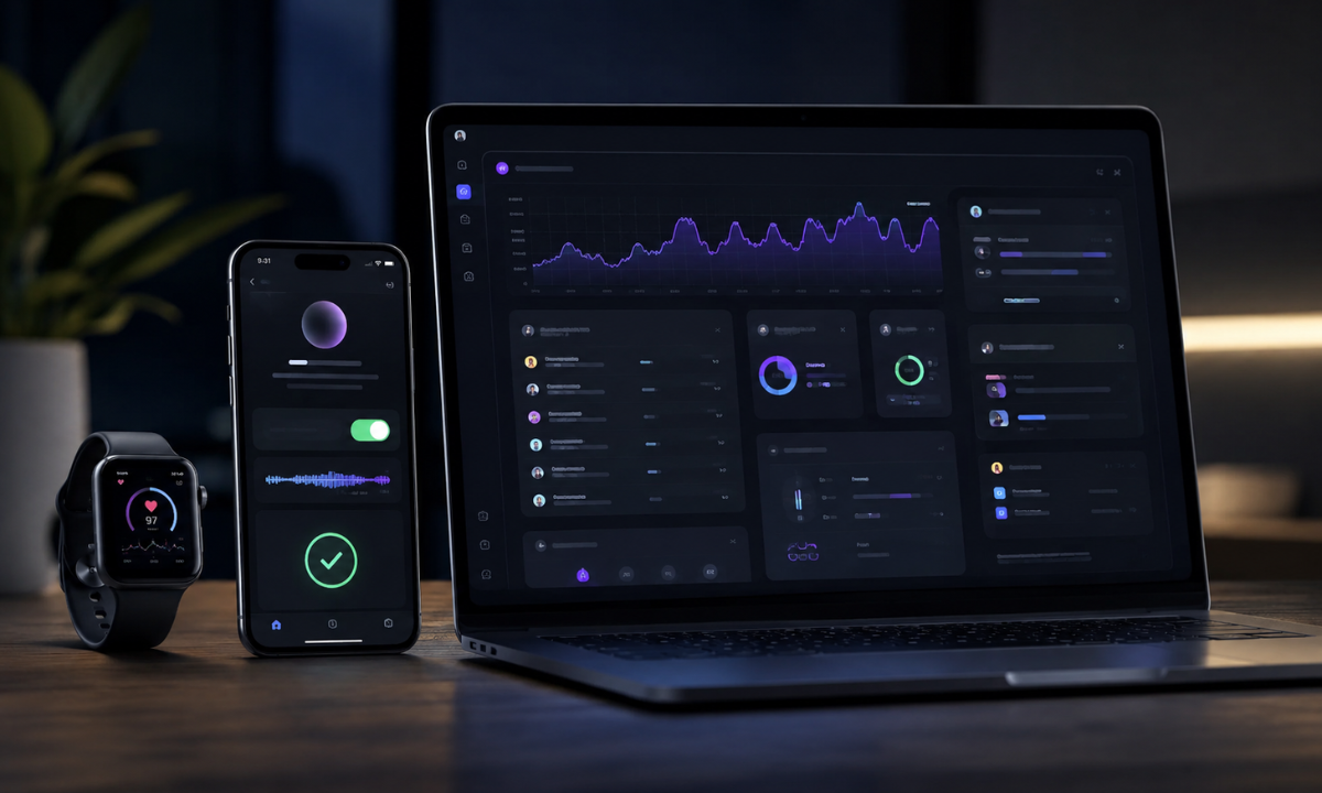
Technology moves incredibly fast, and human expectations move even faster. The interfaces that felt cutting-edge just a few years ago can easily feel clunky, static, and unresponsive today.
When we analyze current U/UX design trends, we see a clear shift away from purely decorative aesthetics. Instead, the industry is focusing on functional, highly responsive patterns that make digital products feel alive, accessible, and perfectly tailored to the user's environment.
If you want to build interfaces that feel truly modern in 2026, you must master the following three structural patterns:
Micro-Interactions: The Details that Delight
A micro-interaction is a tiny, highly specific animation or visual change that occurs when a user interacts with a product. While they might seem like trivial afterthoughts, these small details are the secret ingredient that transforms a boring application into a highly engaging experience.
The Practical Application: Think about the "pull-to-refresh" action on your favorite social media feed, the satisfying little bounce of a toggle switch turning green, or the slight vibration (haptic feedback) your phone gives you when you type a password correctly. These are not just visual flourishes. Micro-interactions serve a critical psychological purpose: they provide immediate, intuitive feedback.
They reassure the user's brain that the system heard their command and is actively responding to it, preventing the frustration of clicking a button and wondering if the app is frozen.
Adaptive and Fluid Layouts: Beyond the Desktop
We no longer live in a world where everyone browses the internet on a standard 15-inch laptop screen.
A user might start reading an article on their smartwatch, continue it on their smartphone during a commute, and finish it on a massive desktop monitor at the office. Modern interfaces must be entirely fluid, automatically reshaping themselves to fit the physical constraints of any device.
The Practical Application: If you design a complex banking dashboard with four columns of financial data for a desktop, you cannot simply shrink that exact layout down to a six-inch mobile screen. The text would be unreadable, and the buttons would be too small to tap.
An adaptive layout mathematically recognizes the screen size and rearranges the puzzle pieces. On a phone, those four columns automatically stack into a single, vertical scroll, and the tiny navigation links transform into a thumb-friendly "hamburger" menu at the bottom of the screen.
Dark Mode & Deep Accessibility
In the past, accessibility was often treated as an afterthought to a final checklist to complete right before a product launched. Today, building inclusive interfaces is a foundational requirement from day one. One of the most visible examples of this is the universal adoption of Dark Mode.
The Practical Application: Dark Mode is much more than a sleek alternative color palette. For users in low-light environments, it drastically reduces eye strain and cognitive fatigue. For devices with OLED screens, it significantly extends battery life. However, a designer cannot simply invert the colors from white to black.
They must carefully calculate contrast ratios to ensure text remains entirely readable and that color-blind users can still distinguish between a red "Error" button and a green "Success" button. By prioritizing accessible patterns, designers ensure their product is usable by everyone, regardless of their physical environment or visual capabilities.
The Designer's Toolkit: Hard Skills You Need to Build

You understand human psychology, and you know the fundamental principles of a great layout. Now, how do you actually build the product?
To transition from abstract ideas into a functional digital space, professionals must develop a specific, highly technical set of UI/UX design skills. The day-to-day job is rarely about drawing pretty illustrations; it is about structural engineering and creating logical systems.
To execute modern interfaces, designers rely on three core technical disciplines:
1. Wireframing vs. Prototyping
The biggest mistake a beginner can make is opening design software and immediately adding colors, fonts, and photos. Professional designers build applications in stages to ensure the logic works before they spend hours on the visual aesthetics. They do this through wireframing and prototyping.
Think of a wireframe as the architectural blueprint of a house, detailing where the walls and doors go. A prototype, on the other hand, is the fully furnished model home that you can actually walk through.
Here is exactly how these two critical phases differ:
|
Feature |
Wireframing |
Prototyping
|
|---|---|---|
|
Primary Goal |
To map out the structure, layout, and basic navigation logic. |
To simulate the final user experience and test interactive elements. |
|
Visual Style |
Low-fidelity. Strictly black, white, and gray. No real images or brand colors. |
High-fidelity. Uses final typography, brand colors, and polished graphics. |
|
Interactivity |
Static. It is simply a flat layout of where elements will live on the screen. |
Dynamic. Buttons are clickable, menus open, and screens transition naturally. |
|
Target Audience |
Internal team members, product managers, and developers to align on structure. |
Real users for usability testing, and stakeholders for final project approval. |
2. Design Systems
In a large tech company, you might have fifty different designers working on the same app. If every designer draws their own version of a "Submit" button, the app will instantly look chaotic and unprofessional.
To solve this, modern designers build Design Systems. A design system is a comprehensive, centralized library of reusable components. It contains the exact hex codes for brand colors, the specific font sizes for headings, and a master collection of every button, drop-down menu, and icon the company uses.
When a designer needs a button, they do not draw a new one; they drag and drop the official component from the library. This ensures absolute visual consistency across thousands of screens and dramatically speeds up the production process.
3. Industry-Standard Tooling
While tools frequently change, the underlying logic remains the same. However, to step into a professional role today, you must be fluent in the industry-standard software that powers collaborative design.
Currently, Figma is the undisputed center of the design world. Unlike older software that saved files locally on your computer, Figma operates entirely in the cloud.
It allows multiple designers, product managers, and developers to work inside the same file simultaneously, much like a Google Doc. Mastering Figma is not just about learning keyboard shortcuts; it is about learning how to organize component libraries, set up fluid grids, and structure your files so that developers can easily read them.
Bridging the Gap: Testing and Working with Developers

A beautiful prototype is still just a concept until it is tested by real people and translated into live code. Many beginners assume that once the design is approved, their job is done. In reality, the most critical phases of the design process are validation and collaboration.
To bridge the gap between a mock-up and a functioning product, designers must master two essential collaborative processes:
Usability Testing: Leaving Your Ego at the Door!
You are not your user. Just because a layout makes perfect sense to you does not mean it will make sense to a first-time visitor. Usability testing is the process of putting your interactive prototype in front of real people and silently observing how they use it.
-
The Practical Application: You give a user a specific task, such as "Find a pair of running shoes in a size 10 and add them to your cart." You do not help them or guide them. You simply watch. If three different users all get stuck on the same filter menu, you know exactly where your design is failing. This process requires a designer to leave their ego at the door; if the user is confused, the design, not the user is wrong.
The Developer Handoff: Speaking the Same Language
Designers do not build the final, working product alone; they rely entirely on front-end developers to write the code that brings the interface to life. The "handoff" is the crucial moment when the designer passes their Figma files over to the engineering team.
-
The Practical Application: A professional handoff is not just emailing a static image to a developer. A designer must provide all the necessary assets, such as exported icons, exact spacing measurements (padding and margins), and clear explanations of how micro-interactions should behave. By learning basic front-end concepts like CSS and HTML structure, a designer can structure their files logically, making the developer's job infinitely easier and ensuring the final product looks exactly like the original prototype.
Why Choose Apponix?
If you are ready to stop just reading about interface design and start actually building adaptive digital ecosystems, it is time to get hands-on. Transitioning into this career requires more than watching generic video tutorials; it requires structured mentorship, real-world projects, and a professional portfolio.
As a premier Training Institute in Bangalore, Apponix Technologies bridges the gap between basic theory and professional execution.
Here is exactly what sets our specialized curriculum apart:
-
100% Practical Execution: Move past textbooks. You will build live, interactive prototypes and solve the exact architectural problems faced by modern tech companies.
-
Industry-Expert Mentorship: Learn directly from seasoned professionals who review your wireframes, correct your workflows, and teach you how to defend your design choices.
-
Production-Ready Portfolio Building: You won't just graduate with a certificate; you will leave with a polished, comprehensive portfolio that proves your capabilities to hiring managers.
We de-risk your career pivot with advanced interview preparation, resume optimization, and direct routing to leading multinational technology organizations.
Conclusion
Digital products do not need more people who can just draw pretty screens; they demand problem-solvers who can orchestrate context, human psychology, and clean logic into a unified, effortless experience. Every app, website, and digital dashboard you use is silently guiding you, and learning how to build those invisible tracks is one of the most rewarding and highly sought-after skills in the modern tech sector.
Take absolute command of your digital career today. Master the advanced skills defining the global technology sector and start building the interfaces of the future with Apponix.
Reference:
https://fuselabcreative.com/ui-ux-interaction-design-guide/
https://motiongility.com/ui-ux-design-basics/

Apponix Academy
Apponix Academy