POPULAR COURSES
Master Programs


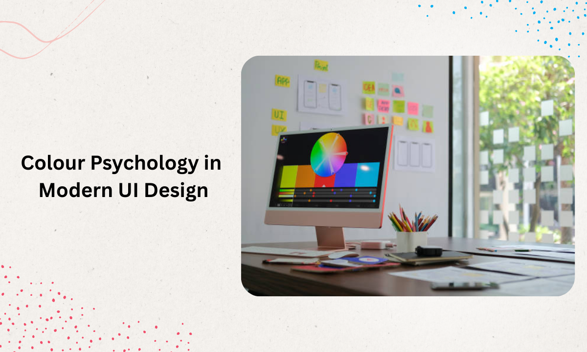
Table of contents:
|
1. What is Colour Psychology and Why It Matters |
|
2. Colours and Emotions: The Heart of Design |
|
3. Branding and Identity: Using Colour to Tell the Story |
|
4. Visual Hierarchy and Aesthetic Appeal |
|
5. User Engagement and Psychological Impact |
|
6. Mood and Atmosphere: Setting the Tone for Experience |
|
7. Practical Tips for Applying Colour Psychology in UI Design |
|
8. Wrapping Up |
|
9. FAQs |
When I step into the classroom as a trainer teaching a UI/UX design course in Bangalore, one of the first and most powerful concepts I introduce to students is color psychology. Understanding the psychology of color is not just about picking pretty hues; it’s a critical tool for creating designs that resonate emotionally, support a brand’s vision, enhance user engagement and deliver results.
Let’s explore how this works in modern UI design and how you, whether a designer or an aspiring one, can apply these principles meaningfully.
What is Colour Psychology and Why It Matters
At its core, color psychology explores how colors influence human feelings, perceptions and behaviours. In digital product design, especially UI/UX, the color psychology meaning becomes very concrete: how the choice and combination of colors affect how users perceive interfaces, take actions, react to calls-to-action, and interpret a brand’s identity.
Why is this so important? Because colours aren’t just decoration, they carry meaning. They set the mood and atmosphere of an interface, guide the user’s eye via visual hierarchy, influence emotions and ultimately shape the user’s response. When I teach a UI/UX design course in Bangalore, I emphasise that a designer’s palette is a strategic asset, not merely aesthetic.
Colours and Emotions: The Heart of Design

One of the foundational connections in this field is between colours and emotions. Each hue tends to evoke certain feelings, though cultural factors and personal context always play a role. Knowing these associations allows a designer to craft UI that subtly influences mood.
-
For example, red often signifies urgency, passion, and energy.
-
Blue tends to convey calmness, trust, and reliability.
-
Green evokes growth, harmony, nature or wellness.
-
Yellow brings optimism and warmth, but also caution if used heavily.
In my sessions, I remind students: when you pick a colour for a UI element, say a button or background, ask, "What mood am I trying to build?" What emotional reaction do I want from the user? That is the power of colour psychology.
Branding and Identity: Using Colour to Tell the Story
Beyond individual UI elements, the role of colour in branding and identity is immense. The psychology of colours in branding links your visual palette to your brand’s personality. When designing an app or website, the colour choices signal to the user who the brand is: playful or serious, luxury or accessible, tech-savvy or earthy.
When I train UI designers, I emphasise: your brand colour scheme must align with your brand values, target audience, and messaging. Consistent colour usage fosters recognition, trust and a coherent brand experience.
For instance, if your brand identity is about innovation and trust (like a fintech app), cooler and stable colours might feature strongly. If the brand is lifestyle and energy, warmer, vibrant colours may dominate. The translator between brand strategy and visual interface? That’s colour psychology in action.
Visual Hierarchy and Aesthetic Appeal
One of the practical UI uses of colour is establishing visual hierarchy. Good UI design doesn’t just look good; it guides the user’s attention, supports usability, and makes the key actions obvious. Through colour contrast, saturation, tone and placement, you can make primary actions, secondary content and tertiary elements clear.
In class, I show students how a button with a high-contrast accent colour stands out versus a muted background. That accent becomes the visual cue for action. This directly ties into aesthetic appeal, because when things are visually harmonious yet functionally clear, the user feels a smoother, more pleasing experience.
Thus, effective colour psychology is not just about bold or trendy colours; it’s about harmony, accessibility, contrast and clarity.
User Engagement and Psychological Impact
One of the major payoffs of mastering color psychology is improved user engagement. When colours align with the emotional intent of the interface and user context, they reduce friction, build trust, invite interaction, and ultimately support conversions or retention.
The psychological impact of colours can be seen in many UI/UX studies: how colour choices influence users' decision-making, how they perceive usability and how they feel about the product.
In my instructional sessions (and real-world design scenarios), we consider questions like, 'Does this colour encourage clicking?' Does it feel like part of the brand? Does it distract from or support usability? Does it build the right mood for the task (e.g., serious vs playful)? Through exercises, we test iterations of colour schemes to see which ones better support engagement.
Mood and Atmosphere: Setting the Tone for Experience
Every interface creates a world of its own. The right colour scheme helps set the mood and atmosphere of that world. A wellness app might want a serene atmosphere with soft greens and blues; a gaming interface might opt for bold purples and reds with high energy; an e-commerce site may aim for trust with blues and greens interspersed with highlight colours for urgency.
In our UI UX design course in Bangalore, we often start a project by defining the mood we want: calming, energetic, authoritative, or friendly. Then we choose a palette that supports it. Aligning mood with colour is a core part of how colour psychology is leveraged.
Besides mood, atmosphere also depends on cultural interpretation, context and even accessibility. A colour might feel one way in one region and another in a different culture, something I always caution my students about.
Practical Tips for Applying Colour Psychology in UI Design
Here are several actionable pointers I share in training that you can apply to your next UI project:
-
Define your brand personality and mood first; colours follow that.
-
Choose a dominant colour that aligns with emotion and brand identity.
-
Use accent colours to highlight CTAs and visual hierarchy.
-
Ensure contrast and accessibility (for readability, WCAG compliance).
-
Test how colours perform in real-world contexts (lighting, screen types).
-
Be aware of cultural/contextual colour meanings; what works in one region may differ in another.
-
Iterate and test: use A/B or user feedback to refine your palette.
-
Keep it consistent: don’t use wildly varying palettes across screens; consistency supports recognition and usability.
These tips help bridge the theory of colour psychology with real UI design practice.
Wrapping Up
As a trainer at Apponix Training Institute in Bangalore, I’ve seen countless UI/UX designers transform good layouts into exceptional experiences simply by harnessing the power of colour.
In our UI UX design course in Bangalore, you understand the importance of color psychology; you don’t just pick a colour because “it looks nice”—you pick a colour because you know the mood it creates, the action it supports, the brand identity it reinforces, and the emotional resonance it brings.
Whether you're designing your next app interface, website, or brand UI, remember: colour is not just decoration. It’s communication. It’s emotion. It’s user engagement. By mastering colour psychology, you elevate your design from visually pleasing to strategically effective.
FAQs
Q1: What Is The Difference Between “Psychology Of Color” And “Color Psychology”?
Both phrases refer to the same broad concept: how colours influence human thoughts, feelings and behaviours. Often, “psychology of color” is used to emphasise the overall study of colour and human responses, while “color psychology” is more shorthand within design and marketing contexts.
Q2: How Does Colour Psychology Vary Across Cultures?
The meaning of colours can shift substantially across different cultural contexts. For example, white may convey purity in some cultures and mourning in others. As a UI designer or brand builder, especially in a global context (or when teaching others), it’s important to research cultural associations and user demographics before finalising palette choices.
Q3: Can I Lean Only On Colour To Convey Brand Identity And Emotion?
While colour is a powerful tool in branding and UI, it should not stand alone. Typography, imagery, layout, content tone and interactions all work together. The branding and identity journey uses colour as one pillar among many. As I tell my trainees: colour amplifies what your brand is saying; it doesn’t replace it.
Q4: How Does Colour Help With Visual Hierarchy In UI?
Colour helps you direct user attention by using contrast (bright vs muted hues), saturation, and placement. A high-contrast accent colour draws the eye to a call-to-action button; muted background colours let content stand out. This use of colour supports intuitive user flows and reduces cognitive load.
Q5: Can Wrong Colour Choices Harm User Engagement?
Yes, poor colour choices can confuse users, reduce readability, mis‐signal your brand’s tone or even annoy users (e.g., colours that cause eye strain). That’s why I stress test palettes, checking accessibility and aligning colours with both user tasks and brand identity. The psychological impact of colours in negative ways is real if you neglect these factors.

Apponix Academy
Apponix Academy