Table of contents:
|
1. What Is Data Storytelling? |
|
2. Why Data-Driven Storytelling Matters in Analytics Careers |
|
3. Data Storytelling Basics: What You Must Master |
|
4. Data Storytelling Tools: What to Use |
|
5. Data Storytelling Visualisation: Bringing It to Life |
|
6. Data Storytelling in Power BI: A Special Focus |
|
7. Examples of Storytelling: Putting Theory into Practice |
|
8. Data Storytelling Certification & Training |
|
9. Why Analytics Careers Are Now Centred Around Storytelling |
|
10. Wrapping up |
|
11. Frequently Asked Questions (FAQs) |
As a trainer at Apponix Training Institute in Bangalore, I have seen firsthand how the landscape of analytics careers is shifting, and central to that shift is data storytelling. It’s no longer sufficient to simply crunch numbers or generate dashboards. Analysts, data scientists and business intelligence professionals are increasingly expected to translate complex data into narratives that drive decisions.
In this blog, I will walk you through what data storytelling really means, why it’s essential in modern analytics careers, and how you can build strong skills through a data science course in Bangalore that trains you with tools like data storytelling in Power BI and other visualisation platforms.
What Is Data Storytelling?

At its core, data storytelling is the art and science of weaving a data-driven narrative. It involves:
-
Collecting and analysing data
-
Creating effective visuals and
-
Crafting a narrative that gives context to the numbers and influences decisions.
In other words, it’s more than just charts or reports; it’s the ability to tell a story with the insight you uncover so that stakeholders can act. In fact, job-role listings already identify “data storyteller” as a distinct title, meaning the person who bridges analysis and communication.
Why Data-Driven Storytelling Matters in Analytics Careers
In analytics careers today, technical skills like querying data, building models or creating dashboards are expected. But what differentiates the standout professionals is mastery of data-driven storytelling: the ability to craft narratives that stakeholders understand and trust.
-
Employers are looking for analysts and BI professionals who can present insights clearly and compellingly.
-
Viewing raw data and presenting dashboards is useful, but without a narrative, the impact is limited. Data storytelling ensures the insights lead to action.
-
In our training sessions, I emphasise that analytics professionals should think of themselves as “storytellers of data”, not just number crunchers.
By grasping and applying data storytelling basics, you elevate your value: you become someone who drives decisions rather than someone who merely reports on metrics.
Data Storytelling Basics: What You Must Master
Here are the fundamentals I cover with my students:
-
Clear Narrative - Begin with a message. What is the key insight? Then build the story around that.
-
Appropriate Visualisation – Select charts or visuals that support the narrative (for example, trend lines for time series, dot plots for comparison) rather than defaulting to pie charts. Tools like Microsoft Power BI support this.
-
Audience-Centred Approach – Know who you are telling the story to. A CFO needs a different context than a technical team.
-
Simplicity and Focus – Avoid clutter, highlight what matters. The story loses impact if the audience gets lost in extraneous detail.
-
Actionable Insight – The narrative should lead to a decision or action. “Here’s the finding, and here’s what we should do.”
-
Data Quality & Context – Narrative must be grounded in reliable data and aligned with business context.
These basics help anyone make the jump from producing dashboards to telling stories with data.
Data Storytelling Tools: What to Use
One of the critical enablers of effective storytelling is the toolset. Here are some of the tools you should get comfortable with when focusing on data storytelling:
-
Power BI – As Microsoft notes, Power BI can help you craft the story you want to tell, supporting intuitive dashboards that “decipher data and share insights”.
-
Other platforms and features: Visualisation platforms like Tableau, Qlik Sense, and specialised storytelling features have emerged.
-
As a trainer, I recommend building hands-on experience: learning how to design the narrative, connect datasets, choose visuals, and present with impact.
In short, mastering the tools is necessary, but framing the story remains the differentiator.
Data Storytelling Visualisation: Bringing It to Life
When we talk of data storytelling visualisation, what we mean is visually representing your narrative in a way that’s intuitive and meaningful for your audience. In training sessions, we emphasise:
-
Choosing the right chart or graph (for example, dot plots for comparisons, funnel charts for processes) based on the story rather than the tool default.
-
Using design principles such as colour, layout, and annotation to guide focus and understanding.
-
Integrating narrative text or call-outs alongside visuals to explain the “why” behind the numbers.
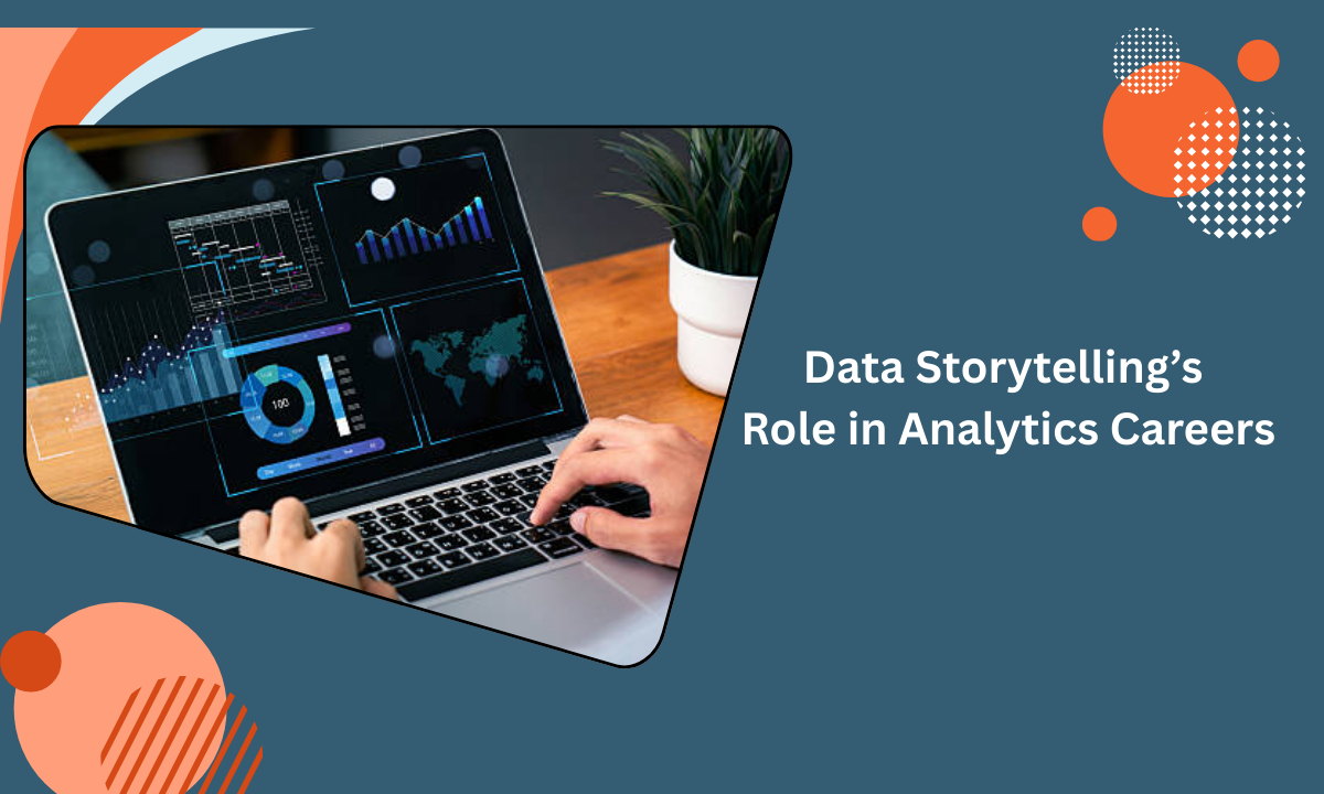
Visualisation isn’t just “making things look pretty”; it’s about enhancing comprehension and retaining attention. Through regular practice, I encourage learners to experiment with visuals in Power BI and other tools, but always anchor them to a narrative.
Data Storytelling in Power BI: A Special Focus
Given how central Power BI is in many analytics environments, I train students specifically in data storytelling in Power BI. Some key points:
-
Power BI supports creating interactive dashboards, embedding narrative elements, and making reports accessible to stakeholders.
-
It allows linking datasets and applying filters and slicers, which let an audience explore the story themselves if needed, enhancing engagement.
-
As part of our training modules, we build stories in Power BI: we define a key insight, design visuals, build a dashboard, and then craft how we’ll present that to a business audience.
-
I emphasise that knowing Power BI features is important, but knowing how to present the story using Power BI is what creates impact.
For analytics professionals, proficiency in Power BI combined with a storytelling mindset makes for a powerful career differentiator.
Examples of Storytelling: Putting Theory into Practice
In real-world analytics careers, you will see examples of storytelling where the data narrative shifts business decisions. For instance:
-
A retail chain uses sales data and customer segmentation to build a story of underperforming stores; the narrative leads to closing decisions and resource reallocation.
-
A healthcare provider uses patient outcomes and cost data to tell a story of process improvement; visualising key metrics leads to operational changes.
-
As one practitioner stated, “All we do is tell stories with the dashboards we’ve built…” Depending on the company, it may be the same role as a data analyst or data scientist.”
In each case, the analytics career path includes not just generating numbers but also crafting narratives, presenting to stakeholders, and influencing action. When you train in these environments, I encourage you to build a portfolio of storytelling examples and show how you translated data into decisions.
Data Storytelling Certification & Training
For professionals trying to upskill, pursuing a data storytelling certification or formal training can help validate your capability. While globally many certifications exist, locally we also focus on training institutes offering relevant courses (for example, a data science course in Bangalore) that include modules on data storytelling and visualization.
In our institute, we incorporate:
-
Foundational topics in analytics and visualization
-
A dedicated module on data-driven storytelling and narrative techniques
-
Hands-on with Power BI storytelling, tools and visualisation
-
Workshops on presenting to business stakeholders
Having a recognised certification or course that emphasises storytelling gives your resume a boost, especially in today’s competitiveness for analytics roles.
Why Analytics Careers Are Now Centred Around Storytelling
Pulling the above threads together: the role of data storytelling in modern data analytics careers cannot be overstated. Here’s why:
-
Employers expect more than technical proficiency; they expect communication and influence.
-
The complexity of data and analytics still needs the simplicity of a story. Without narrative, insights may remain unused.
-
Analytics professionals who can marry data, visuals and narrative stand out and advance faster.
-
From entry-level analysts to senior BI professionals, the ability to tell a story with data propels your value.
In our training sessions, I emphasise to learners: don’t just learn SQL or Power BI — learn how to tell the story behind the dashboards you build. That mindset gives you longer-term career leverage.
Wrapping Up
To sum up: data storytelling is now a core capability in analytics careers. By understanding what is data storytelling, practising data-driven storytelling, mastering data storytelling basics, using the right data storytelling tools, focusing on data storytelling visualisation, and leveraging platforms like data storytelling in Power BI, you position yourself for success.
Further, pursuing certification and training through reputable institutes that offer a data science course in Bangalore helps validate your skills.
As a trainer at Apponix Training Institute in Bangalore, I encourage you to build your narrative mindset, hone your visualisation skills, and practice presenting stories rather than simply reporting metrics. The career payoff is clear: you become a trusted voice in analytics, not just a data handler.
Frequently Asked Questions (FAQs)
Q1: What’s the difference between data storytelling and data visualisation?
A: Data visualisation is about presenting data via charts and visuals. Data storytelling goes further; it builds a narrative around those visuals so that the insights are clear, contextualised and actionable.
Q2: Can I become good at data storytelling even without a strong analytics background?
A: Yes, while analytics/data skills are helpful, the core of storytelling is communication, context and narrative. Many training programmes begin with basics and help non-technical professionals build effective storytelling skills.
Q3: Which tools are best for data storytelling?
A: There are many, including Power BI, Tableau, Qlik, and specialised platforms. The important part is not just the tool but how you use it to craft your story. If you learn Power BI well (including how to build story-driven dashboards), you’re well-positioned.
Q4: Is there a certification specifically for data storytelling?
A: While there might not be a single global “data storytelling certification”, many data science and analytics certifications include storytelling and visualisation modules. Training institutes often offer focused courses on data storytelling, which you can highlight on your resume.
Q5: How do I showcase data storytelling skills when applying for analytics jobs?
A: Build a portfolio: include before/after visuals, dashboards with narrative explanations, and case studies where your story influenced decision-making. During interviews, explain not just the “what” (data) but the “why” and “how” of your story.


