POPULAR COURSES
Master Programs


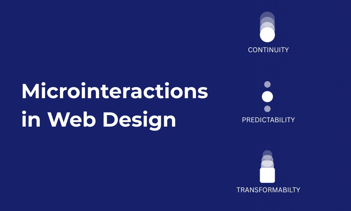
Table of contents:
|
1. What Are Microinteractions? |
|
2. Why Microinteractions Matter in Web Design |
|
3. Types & Examples of Microinteractions |
|
4. Best Practices and Design Principles |
|
5. Tools & Resources for Microinteractions |
|
6. Using Microinteractions in Figma & Prototyping |
|
7. Common Pitfalls to Avoid |
|
8. Wrapping Up |
|
9. Frequently Asked Questions (FAQs) |
When we teach microinteractions in web design at Apponix, I always tell our students: it’s often those tiniest animations, hovers, or feedback cues that distinguish a website that feels alive from one that feels flat.
Microinteractions may look subtle, but they have a profound effect on user satisfaction, usability, and emotional connection.
In this article, I’ll walk you through how microinteractions work, what kinds of web design effects you can achieve, best practices, tools, and why mastering them is a must if you are learning web UI/UX, especially in a web designing training course in Bangalore.
What Are Microinteractions?
A microinteraction is a small moment of feedback or interaction in a digital interface. It might be a button gently transforming when hovered, a switch toggling with a satisfying snap, or a subtle loading animation. These are not full workflows; they’re focused, often single-purpose experiences meant to enhance usability, guide users, or delight subtly.
Microinteractions play a key role in driving clarity and engagement. According to UX research, they help convey system status, prevent errors, and offer feedback that reassures users. And as design domains evolve, we increasingly see microinteractions as integral to fine-tuned user experience.
Each microinteraction typically involves four components:
-
Trigger – The event that starts it (user action or system event)
-
Rules – The logic that determines how it behaves
-
Feedback – What the user sees, hears, or feels in response
-
Loops & Modes – Whether it repeats, transitions, or shifts states
When you understand that framework, you can design with intention rather than just decorating interfaces.
Why Microinteractions Matter in Web Design
You might ask: if they are small, are they really worth the trouble? The answer is yes, especially in modern digital experiences. Here’s how microinteractions deliver impact:
-
Enhancing usability & clarity: A subtle color change, spinner, or validation tick informs users that their action succeeded or failed. That reduces confusion.
-
Providing emotional engagement: A smooth bounce, delight animation, or confirmation microinteraction adds personality and a sense of care.
-
Guiding behavior: Hover effects, micro-animations, and cues can subtly direct users toward calls to action.
-
Error prevention & feedback: If something’s wrong (e.g. a required field is left blank), a microinteraction can prompt correction, reducing frustration and drop-offs.
-
Polish & perceived quality: When a website or app feels “snappy” and responsive, users often attribute it to higher quality, even if they don’t consciously notice every microinteraction.
Poorly implemented microinteractions, however, can backfire. Too many, too flashy, or inconsistent ones distract users rather than help them.
Types & Examples of Microinteractions
Let’s walk through common microinteraction patterns you’ll encounter—and use in your interfaces:
-
Button microinteractions: hover color shifts, press effects, ripple animations, icon transitions
-
Form feedback & validation: Real-time checks, shaking fields, inline error messages
-
Loading indicators & progress spinners: Visual cues during delays
-
Hover or focus effects: Subtle movements or changes on navigation, cards, or images
-
Toggle switches/sliders: Smooth transitions between states
-
Notifications & tooltips: Appear/disappear guidance or status messages
-
Celebration animations: Small animations (checkmarks, confetti) when users complete tasks
-
Scroll transitions or reveal effects: Subtle motion when elements come into view
These microinteractions aren’t just decorative — they help users understand that the system is alive, responsive, and supporting their action.
Best Practices and Design Principles
When we teach microinteractions in our Training Institute in Bangalore, we emphasize that good ones follow core design principles:
-
Purposeful & minimal: Every microinteraction should have intent, don’t add them just for the sake of motion
-
Consistency: Use similar behavior, timing, and style across the interface
-
Responsive & immediate feedback: Users should see an acknowledgement quickly
-
Avoid disruption: Microinteractions should support user flow, not interrupt it
-
Accessibility: Respect reduced motion preferences, allow keyboard triggers, and ensure clarity for users with disabilities
-
Performance-aware: Optimize animations so they don’t slow down your page
-
Test & iterate: Use prototypes and real user testing to refine micro-behaviors
Also, always consider context: a microinteraction that feels delightful in one part may feel out of place elsewhere; it must align with your brand tone and user expectations.
Tools & Resources for Microinteractions
Here are popular microinteraction tools and frameworks that designers and developers use:
-
Figma interactive components/variants, to prototype microinteractions without code
-
Animation libraries / CSS (like GreenSock / GSAP, CSS transitions, Lottie)
-
Framer Motion / React animation tools for dynamic microinteractions in web apps
-
Microinteraction prototyping plugins and utilities
-
Design systems that include microinteraction tokens or pattern libraries
Many design systems now incorporate microinteraction guidelines so everything feels cohesive across the UI.
Using Microinteractions in Figma & Prototyping
As a trainer at Apponix, I often guide our students to prototype microinteractions before development. Figma now offers interactive components, letting UX designers define triggers, states, and transitions inside variants.
You can create a component with different states (e.g. default, hover, clicked), connect them through interaction flows, and simulate microinteractions directly in the prototype. That helps you validate your decisions and test user responses before handing off to developers.
When designing microinteractions in Figma:
-
Keep transitions smooth and fast (200–500 ms range is typical)
-
Use easing curves (ease-in, ease-out) to feel natural
-
Avoid overly elaborate animations; simplicity is powerful
-
Ensure consistency across similar elements so users don’t get surprised
Mastering microinteractions through prototyping tools like Figma lets you iterate fast, gather feedback, and align design intent with execution.
Common Pitfalls to Avoid
Over the years, I have seen learners overdo microinteractions, so here are traps to sidestep:
-
Adding too many animations, causing performance lag or distraction
-
Sluggish, delayed or unnatural transitions
-
Inconsistent behavior between similar elements
-
Microinteractions that override usability or clarity
-
Ignoring users who prefer reduced motion or simpler UI
-
Not factoring in mobile/touch interactions (swipes, taps)
Always keep the user's needs first. If a microinteraction adds friction, remove or simplify it.
Wrapping Up
When I stand before students in Apponix’s Web UI/UX modules, I often challenge them: “Can your design feel alive in that one moment someone hovers or clicks?” Because that is the art of microinteractions in web design, taking what could be static and making it responsive, human, and often delightful.
Microinteractions are neither gimmicks nor afterthoughts. They elevate usability, reinforce brand identity, reduce user uncertainty, and make interfaces feel fluid. Done right, they make users feel seen, understood, and confident. That’s why in our web designing training course in Bangalore, we allocate dedicated hours for microinteraction design, not as extra, but as essential.
If you are entering this domain, I encourage you: start small. Build a button hover, a loading spinner, and a validation feedback. Prototype it in Figma. Test with users. Refine. These micro-moments compound, and very soon your entire UI will feel polished. Over time, what sets a good designer apart is not how many screens they build but how thoughtful each interaction is, even the smallest.
At Apponix Training Institute in Bangalore, we don’t just teach web design; we build designers who think in motion. Enroll in our web designing training course in Bangalore, and let’s bring your interface to life, one microinteraction at a time.
Frequently Asked Questions (FAQs)
Q: What exactly qualifies as a microinteraction?
A: A microinteraction is a focused, single-purpose animation or feedback loop, like a button hover change, toggle switch animation, or inline form validation, that enhances usability and provides feedback.
Q: How do microinteractions improve UX?
A: They help users understand that their actions are recognized, reduce friction, offer guidance, and build trust by giving real-time responses.
Q: Can I build microinteractions without code?
A: Yes, tools like Figma’s interactive components let you prototype many microinteractions in a no-code environment before handing them to developers.
Q: What is a good duration for microinteractions?
A: Typically between 200 ms to 500 ms. That range feels responsive without being jarring.
Q: Should every button have a microinteraction?
A: Not necessarily. You want them where feedback matters, on actions that guide your user or confirm something. Use them thoughtfully.
Q: How do you teach microinteractions effectively in Bangalore?
A: At Apponix, we combine theory, prototyping labs, tool training (Figma, animation libs), and live UI projects. Students see how a tiny feedback animation changes the feel of their interfaces in real time.

Apponix Academy
Apponix Academy