POPULAR COURSES
Master Programs


In today’s digital world, mobile first design is no longer optional; it’s essential. As users increasingly browse on phones, we must ensure every experience starts strong on mobile before scaling upward. But how do we do that well?
In this post, we’ll walk through actionable best practices for how to do mobile first design, explore advantages of mobile first design, show mobile first web design examples, and see how Web Designing Training Course in Bangalore (especially at a top Training Institute in Bangalore) can equip you with the skills to deliver responsive, mobile-first sites that delight users and perform well in search.
Let me tease this: by the end, you will know the mindset, techniques, and design decisions to make your foundation mobile first design and scale gracefully.
What Is “Mobile First Design” and Why It Matters
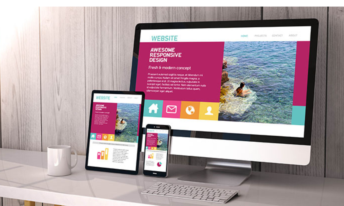
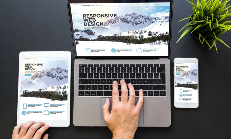
Mobile first design is a design philosophy where we begin by designing for the smallest screens first (smartphones), then gradually enhance for larger devices like tablets and desktops. The concept, introduced by Luke Wroblewski, encourages designers to work within constraints first and then layer in enhancements.
In contrast, traditional responsive design often starts with desktop layouts and then adapts them downward. A mobile-first approach flips that, ensuring that constraints of mobile (screen size, network, touch) are addressed from the start.
Why should we care? A few compelling reasons:
-
Mobile dominance: A large majority of internet usage happens on mobile devices.
-
Search & SEO weight: Google now indexes mobile versions first (mobile-first indexing).
-
Performance benefits: Starting light forces you to optimize images, code, and interactions early.
-
User focus: You clarify what’s essential (content, actions) instead of overloading.
-
Scalable architecture: If your mobile is designed right, scaling up is cleaner than scaling down.
Best Practices: How to Do Mobile First Design Well

Below are the core techniques and design decisions we adopt to achieve truly responsive mobile first responsive design.
1. Prioritize Content & Features
With limited screen real estate, we must decide: what really matters?
-
Do a content inventory (list out all elements, text, images, actions).
-
Rank them by user priority.
-
Show only the must-haves on mobile; others can live in accordions or hidden sections for tablet/desktop.
-
Use progressive enhancement: basic functionality on mobile, enhanced features when more space is available.
2. Simplify Navigation & UI Patterns
-
Mobile navigation must be clear and minimal.
-
Use collapsible menus (hamburger, bottom navigation).
-
Limit the number of main menu items.
-
Avoid hover-based interactions (mobile doesn’t support hover).
-
Design UI elements that are familiar and intuitive.
3. Design for Touch
-
Since users tap, swipe, and pinch, not click, your UI must cater to touch.
-
Make buttons and links large enough (Apple recommends ~44×44 px touch targets).
-
Ample spacing around tap targets to avoid accidental touches.
-
Favor gestures (swipe, pull to refresh) carefully.
-
Don’t rely on hover or mouseover interactions.
4. Optimize Images, Media & Assets
-
Mobile networks may be slower, so keep assets lean.
-
Use responsive image techniques: srcset, sizes, WebP or compressed formats.
-
Lazy-load images that appear below the fold (but ensure critical content is visible).
-
Avoid overly large hero images or background videos on mobile.
-
Only load higher-resolution visuals when screen size allows.
5. Use Fluid Grids & Flexible Layouts
-
Base layout units on percentages or relative values (not fixed px).
-
Use CSS media queries with a min-width approach (e.g., @media (min-width: 600px)) so mobile styles apply by default, and larger styles layer in.
-
Ensure containers, padding, and margins adapt smoothly.
-
Avoid rigid sidebar-style layouts on mobile.
6. Progressive Enhancement & Feature Detection
-
You might add features such as animations or advanced interactions for larger screens—but only after the core mobile experience works.
-
Use feature detection (e.g. @supports) or JavaScript checks to conditionally load enhancements.
7. Accessibility & Inclusive Design
-
Ensure sufficient color contrast.
-
Use semantic HTML (e.g. <nav>, <button>, <main>).
-
Make interactive elements accessible (ARIA, labels).
-
Provide keyboard navigation and screen reader compatibility.
-
Ensure the mobile version mirrors the content of the desktop version (Google expects the same content).
8. Test on Real Devices & Conditions
-
Simulators help, but real device testing catches issues better.
-
Test on various phone models, screen sizes, and OS versions.
-
Use network throttling (3G, 4G) to see how it performs under slower conditions.
-
Monitor CPU, memory, and responsiveness.
-
Iterate based on user feedback.
9. Monitor Performance & Metrics
-
Track metrics like First Contentful Paint (FCP), Time to Interactive (TTI), and Cumulative Layout Shift (CLS).
-
Minify CSS and JS, remove unused code.
-
Use efficient fonts (system fonts, web fonts with fallback).
-
Use caching strategies.
Advantages of Mobile First Design

Choosing a mobile first design approach comes with many benefits:
1. Better user experience on mobile, the primary context of browsing today.
2. SEO boost: mobile-first indexing rewards mobile-optimized sites.
3. Faster performance, leaner design, optimized assets, better load speeds.
4. Less clutter, more focus; encourages minimalism and clarity.
5. Future-proofing: easier to scale up to new device sizes.
6. Cost savings; fewer revisions later, cleaner codebase.
When we build mobile first, we shape a core experience that stands even under constraints, and larger screens become enhancements, not crutches.-
Mobile First Web Design Examples
To see this in action:
-
Airbnb often cited as an example: starts mobile, then scales enhancements upward.
-
Dropbox, Slack, and other modern web apps follow mobile-first strategies.
-
Many portfolio sites and creative agency pages use minimal mobile-first layouts with collapsible sections, then expand into richer visuals on desktop.
You’ll find that top design showcases often strip down for mobile, emphasizing clarity, large CTA, concise text, and clean visuals—exactly what mobile-first pushes you toward.
How Apponix Helps with Mobile First Web Design
At Apponix, we believe theory without practice is hollow. That’s why our Web Designing Training Course in Bangalore (at our leading training institute in Bangalore) is hands-on, with modules that cover:
-
Fundamentals of mobile first responsive design
-
Real-world mobile first web design tutorials, building from scratch mobile layouts
-
Optimization techniques for performance, touch, and accessibility
-
Case studies of mobile-first sites and UI patterns
-
Live testing on devices and feedback loops
-
Integration with CSS frameworks and modern tools
When you train with us, you don’t just learn the “how”; you build real mobile-first sites, troubleshoot challenges, and graduate with a portfolio that proves your skills.
Tips for Implementing Mobile First Design (We’ve Learned)
-
Sketch mobile layouts first (paper or wireframe) before adding features.
-
Keep above-the-fold content compelling; the first screen matters most.
-
Minimize input fields; large forms on mobile feel tedious.
-
Consistent branding from mobile to desktop; don’t reinvent on larger screens.
-
Use “load less first” strategies; defer noncritical scripts and assets.
-
Conduct usability tests early; test prototypes on real mobile users.
-
Use component-based design; build reusable mobile elements you can enhance.
-
Document your breakpoints clearly and modularize your CSS.
-
Continuously audit performance, especially after adding new features.
Wrapping Up
Designing with a mobile first design mindset forces us to master constraints, sharpen priorities, and deliver lean, efficient, high-quality experiences. The shift isn’t just tactical, it’s strategic: mobile users are front and center, performance is baked in, and scaling up becomes smoother.
If you’re looking to nail mobile first responsive design, prototyping, accessibility, performance, and real-world examples, Apponix’s Web Designing Training Course in Bangalore offers the perfect bridge from concept to portfolio. Let us help you master mobile-first, from tutorial to top web projects.
Frequently Asked Questions (FAQs)
Q: Is mobile first design the same as responsive design?
They’re related but different. Mobile first is a design philosophy (design for mobile first). Responsive design is a technique (layouts adapt across screen sizes). Many modern projects combine both: mobile-first approach + responsive techniques.
Q: What are the pitfalls of mobile first design?
You might oversimplify features, feel boxed in during design, or neglect novelty on larger screens. But these are mitigated by planning enhancement layers.
Q: How long to master mobile first design?
Depends on prior experience. With focused training and practice, you can build solid mobile-first sites in a few months.
Q: Will the desktop look suffer if mobile is too prioritized?
Not if you progressively enhance. You start core on mobile, then layer design, features, and enhancements for larger screens.
Q: How to pick a good training institute in Bangalore for mobile first design?
Look for practical, project-based curriculum, real device testing labs, mentorship, and strong placement support.

Apponix Academy
Apponix Academy